twenty-six.design is an independent design and editorial studio and think tank led by Jarrett Fuller. Our work takes shape across a variety of media, from books and websites to podcasts and public relations and we work with clients large and small, around the world.
In addition to client work, we also produce experimental work, research projects, and original content, including the podcast Scratching the Surface, the online archive of graphic design texts readings.design, and other books and speculative projects.
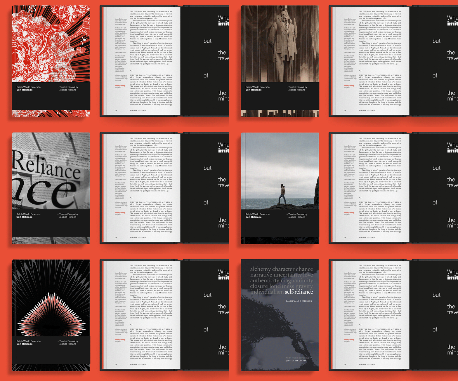
Self Reliance, the new book from Jessica Helfand designed with twenty-six, featured in The Guardian and It's Nice That

Self Reliance, the new book of essays from Jessica Helfand that we helped design, is featured on The Guardian:
The artist and founder-editor of the website Design Observer, Jessica Helfand, spent the early months of the pandemic holed up in New Haven, Connecticut. Rather than baking banana bread, she wrote essays on what it means to be a maker during a crisis, and how making might lead to self-knowledge. She called the series The Self Reliance Project – a reference to the 1841 essay by philosopher Ralph Waldo Emerson, in which he argues for trusting your instincts in times of uncertainty.
Now 12 of the essays have been published, with Emerson’s original text, in a re-edition by publishing platform Volume. Working with designer Jarrett Fuller, Helfand used graphics to draw out text themes in a font combining the Emerson typeface (designed by Joseph Blumenthal for an Emerson essay in the 1930s), with Neue Haas Unica (a hybrid of Helvetica, Univers and Akzidenz Grotesk, adapted by Toshi Omagari, digitally released by Monotype in 2015). It’s a type nerd’s dream.
And on It’s Nice That:
Helfand and her commissioning editor at Thames & Hudson Lucas Dietrich believed the text would have “renewed resonance” for contemporary readers during lockdown. The Self-Reliance Project became a daily essay about “what it means to be a maker during a crisis – to think through making, to know yourself better through the process of producing something – and how this kind of return to self-knowledge might just be the entire point,” Helfand explains. “In a year in which we are all forced to work and live and produce as solo operators, Emerson’s words deserve our attention.”
The release is packed with typographic history, explains Helfand: the original text was set in Emerson, a typeface designed by Joseph Blumenthal at the Bauer Type Foundry in Frankfurt and initially named Spiral. Blumenthal showed it to Stanley Morison, typographic advisor at the British Monotype Corporation, which produced it for machine composition; Morison then recut the type for the Monotype Corporation in 1935. Its first appearance was in a special, private-press edition of Ralph Waldo Emerson’s essay Nature, and was since known as Emerson. Reynold Stone wrote that it “avoided the rigidity of a modern face and preserved some of the virtues of the classic Renaissance types.”